The Challenge: Redesign the reading experience for college students
My Focus: Academic reading on Canvas—where students engage with course readings and participate in discussion boards
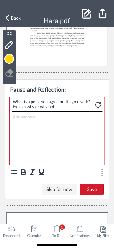
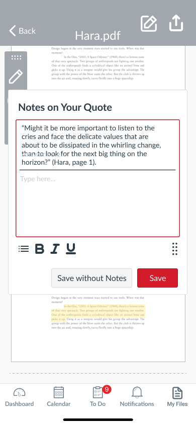
The Solution: An integrated annotation and note-taking feature that helps students stay focused and retain information
Through user interviews and usability testing, I identified key pain points in Canvas's reading experience and designed Note Mode—a feature that complements the existing interface while addressing students' needs for better focus, organization, and knowledge retention during academic reading.
Positive User Feedback
User Interviews Conducted
Rounds of Usability Testing
I interviewed four students across different majors to understand their reading habits, preferences, and pain points. Here's what I discovered:
Pain Point: Losing track while scrolling through PDFs on Canvas
"When it's one long [block of text] all at once, it's too much. There's no motivation because they just drop it all on you, and you don't know where you're going."
Pain Point: Lack of progress indicators and overwhelming interfaces
Appreciated Apple Books for "different light modes and orientations" and adjustable text size, but missed having a progress bar
Pain Point: Eye strain from screen brightness and constant page navigation
Found iPad annotation helpful but disliked having to constantly move the page with her finger to follow the text
Pain Point: Distraction leading to re-reading passages multiple times
"If I'm reading and I'm distracted and have to read passages over and over again"
Across all interviews, I identified three core challenges students face when reading on Canvas:
1. Loss of Focus: Dense text blocks without clear progress indicators make it easy to lose place
2. Limited Engagement: Passive reading without interaction tools leads to information loss
3. Poor Organization: No centralized way to revisit highlights and notes from readings
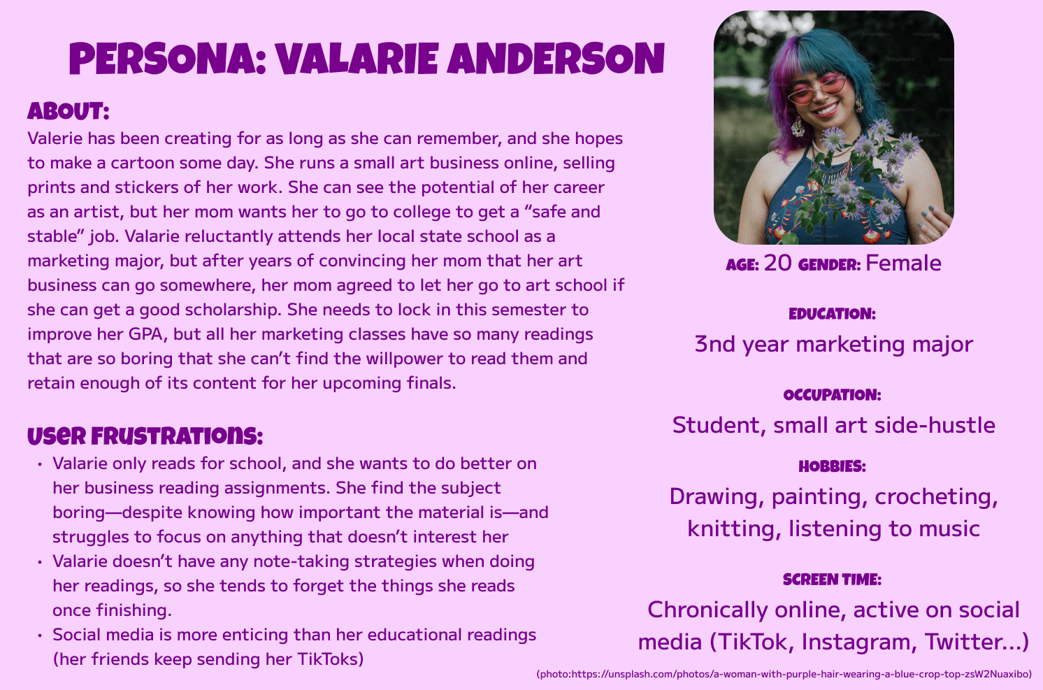
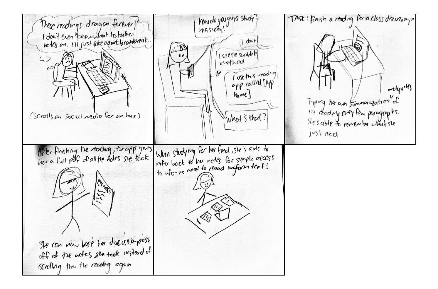
Based on research insights, I created a persona representing our target user—a student who needs better tools to stay engaged with academic readings.
I storyboarded Valarie's experience to visualize how Note Mode would fit into her existing workflow and solve her pain points.
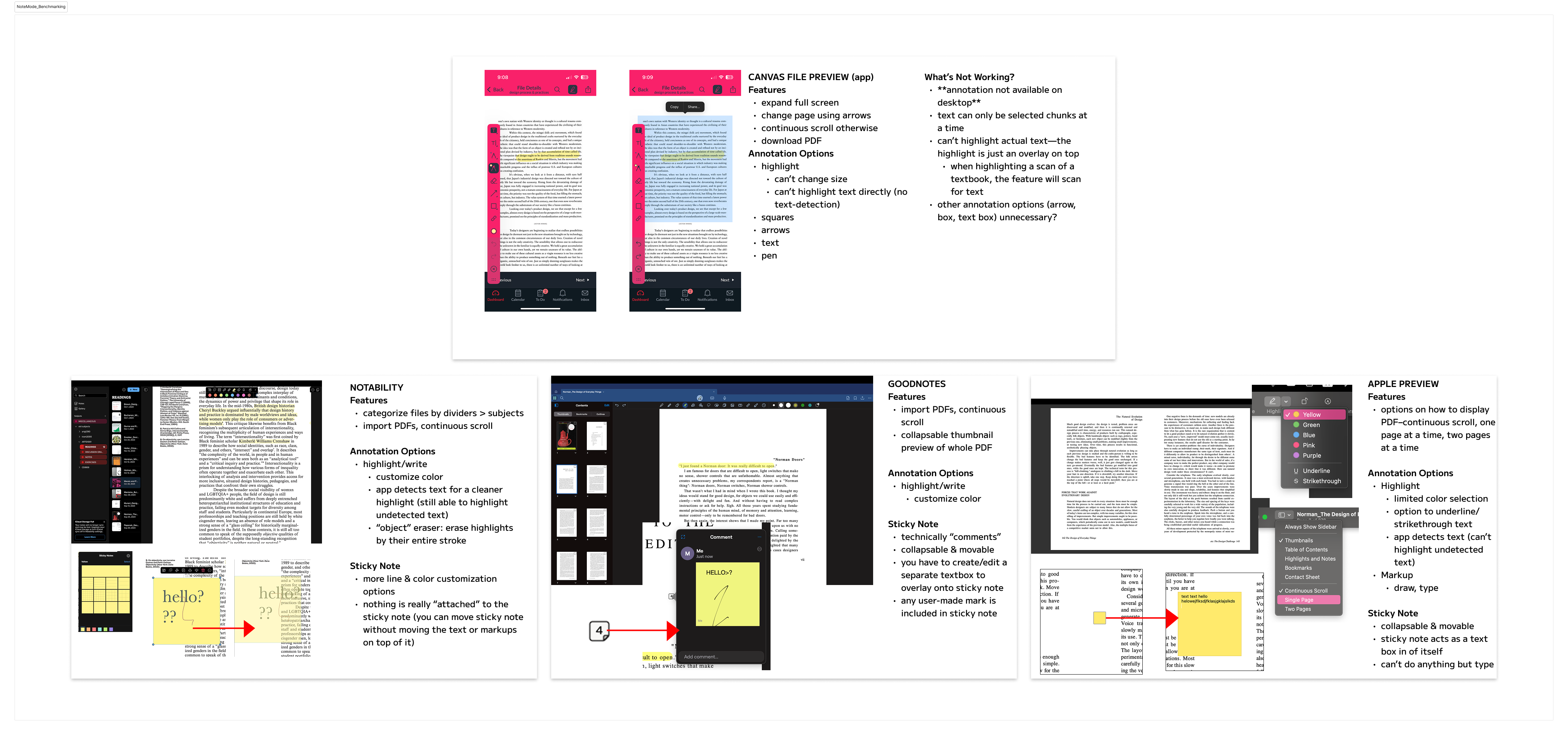
I analyzed annotation features across popular note-taking apps and Canvas's mobile interface to identify opportunities for improvement. This helped me understand what works, what doesn't, and where Canvas could differentiate itself.
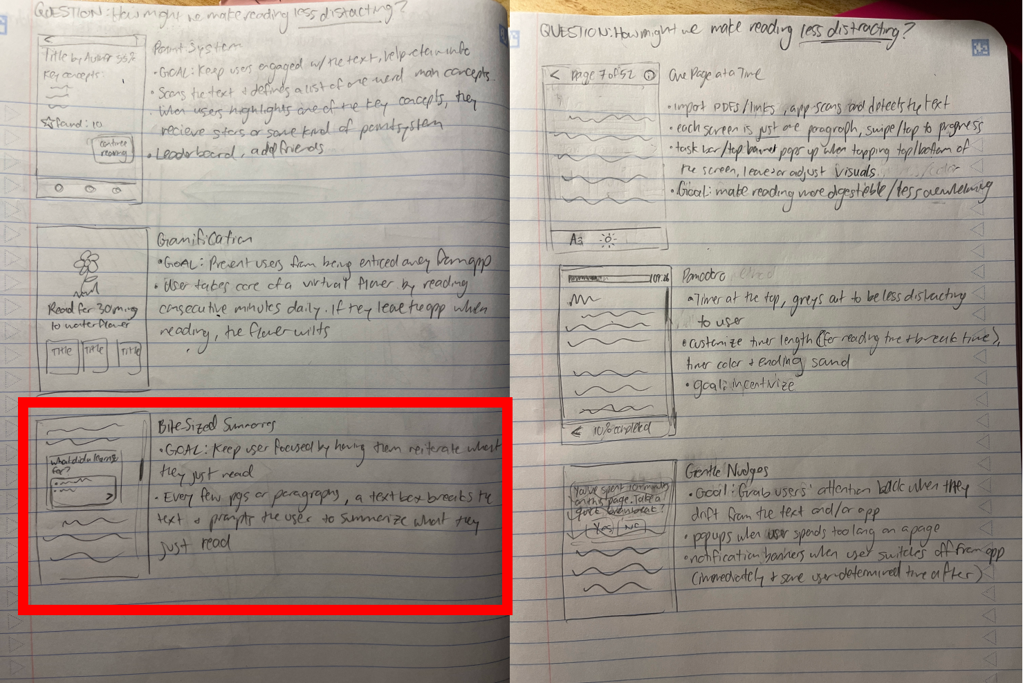
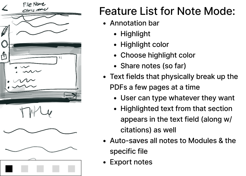
Through rapid sketching, I explored various approaches to solving the core problems—from interactive highlights to reflection prompts to progress tracking.
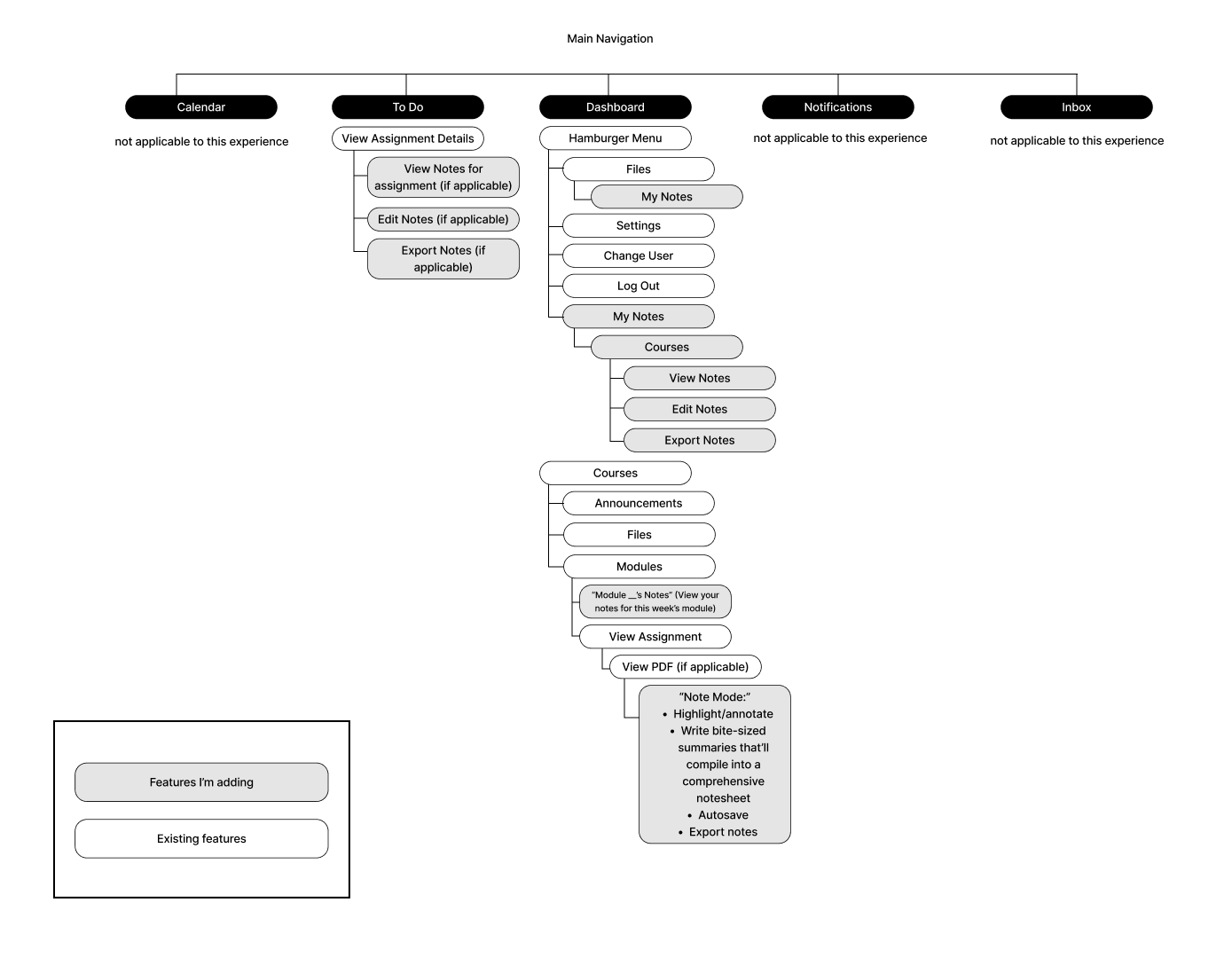
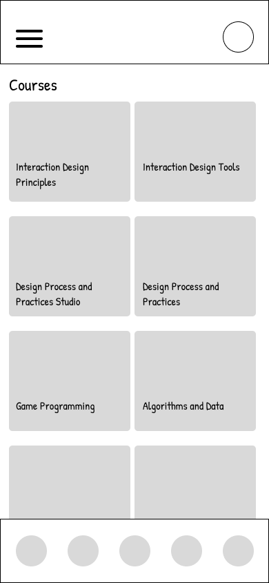
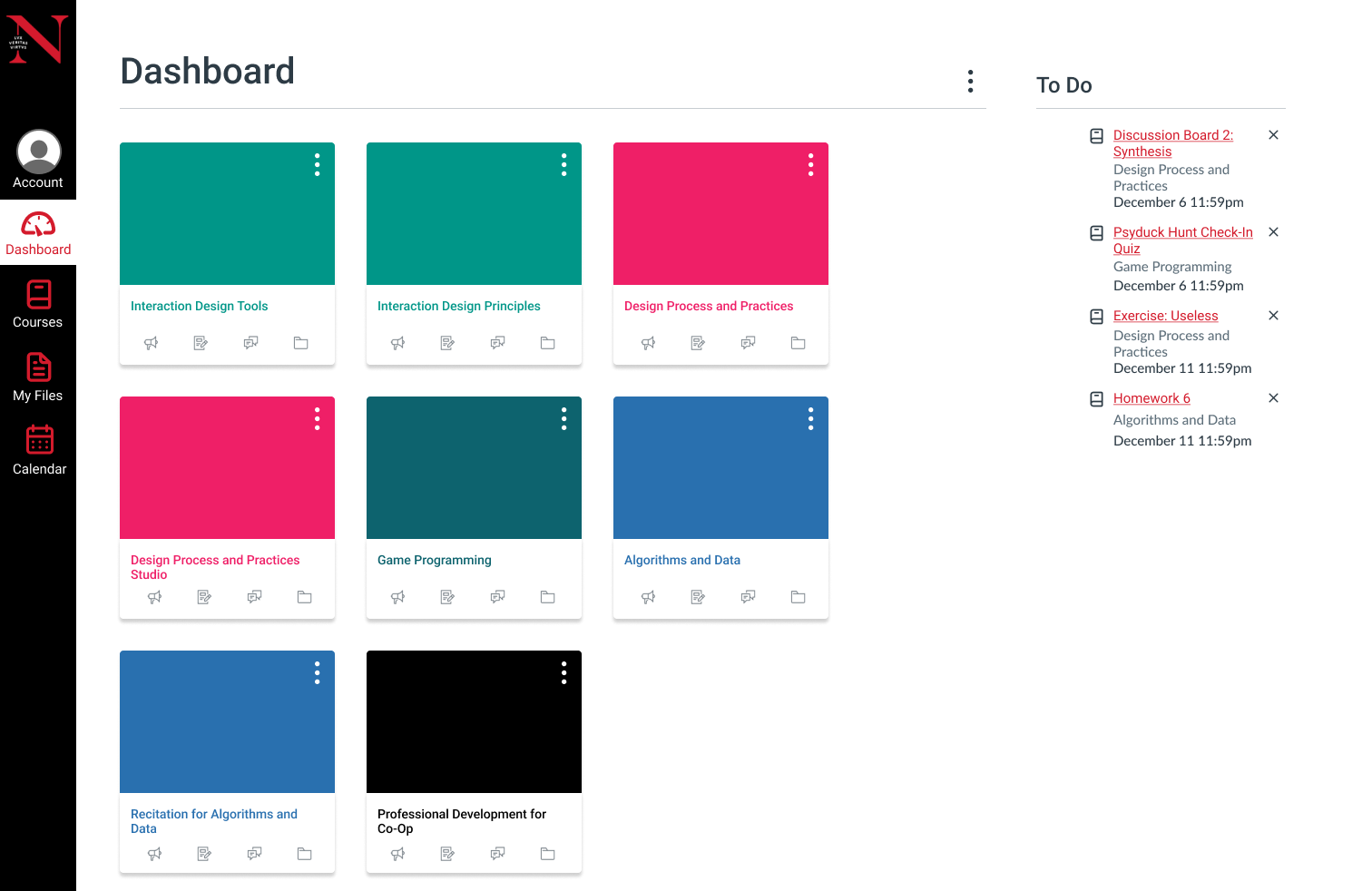
I mapped out Canvas's existing information architecture and identified where Note Mode would integrate seamlessly into the user's workflow.
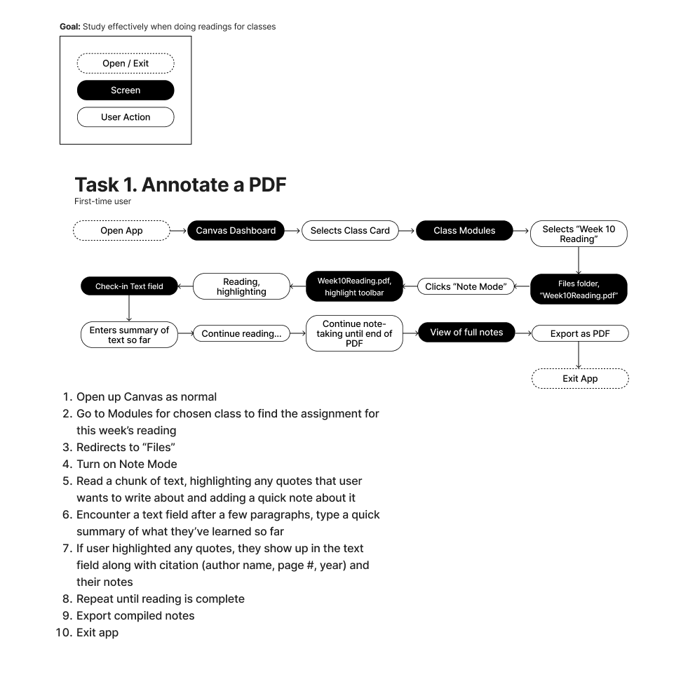
This workflow shows how students would move through the Note Mode feature, from accessing a reading to reviewing their annotations later.
I started with paper wireframes to quickly test different layouts and interaction patterns before committing to digital designs. This approach saved time and allowed for rapid iteration.
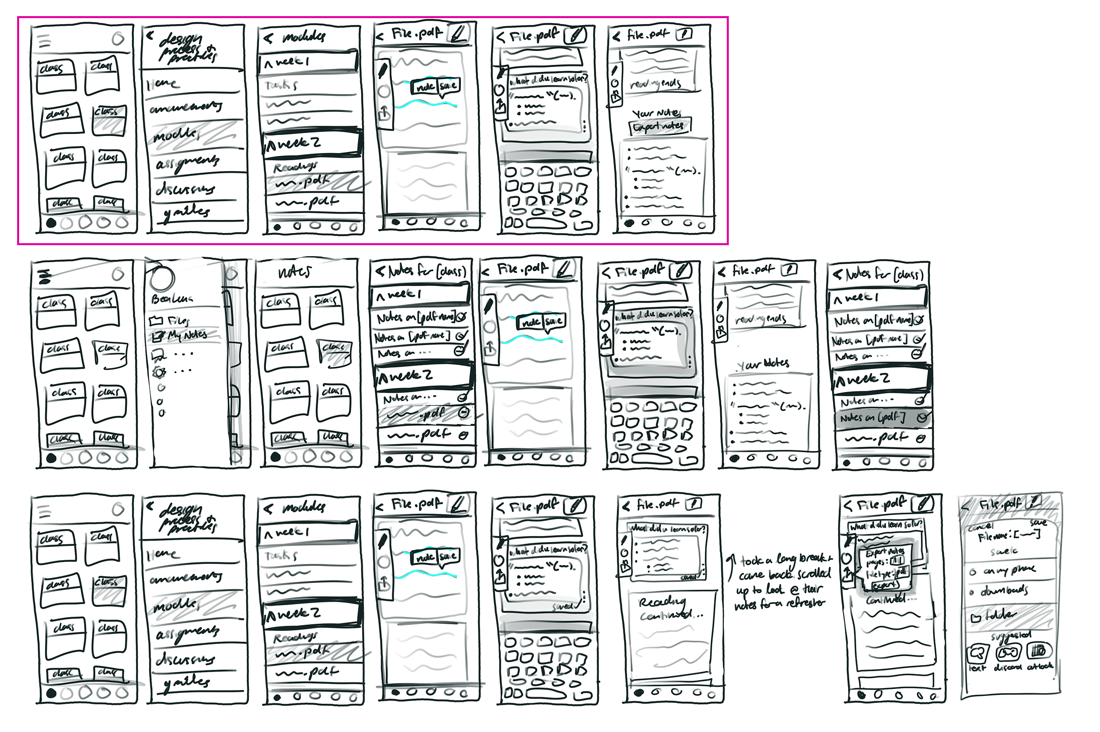
Once the core interactions were validated, I created digital wireframes to refine the layout and prepare for usability testing. Click the screenshots below to try out my low-fi prototypes!
I conducted usability tests with students to validate my design decisions and identify areas for improvement. The feedback was overwhelmingly positive, with over 90% of participants finding Note Mode intuitive and valuable.
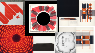
To ensure Note Mode felt native to Canvas, I created a mood board capturing the platform's existing aesthetic—academic, accessible, and straightforward.
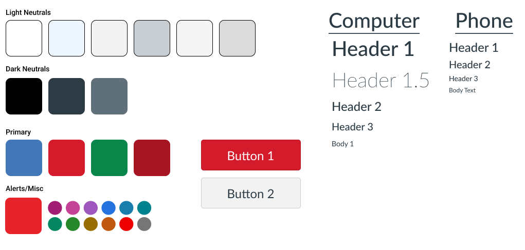
I documented Canvas's typography and color palette to ensure my designs would integrate seamlessly with the existing interface. Why reinvent the wheel when familiarity improves usability?
Try it for yourself here!
The final prototype demonstrates how Note Mode integrates into Canvas's existing interface, allowing students to annotate readings, write reflections, and review their notes—all within a familiar environment.
Since students often read on-the-go, I designed mobile screens that maintain Note Mode's core functionality while adapting to smaller screens. The challenge was preserving the annotation experience without cluttering the limited space.
This project taught me the importance of letting user research guide design decisions rather than assumptions. Every feature in Note Mode directly addresses a pain point identified during interviews—from Reagan's struggle with losing her place to Mason's need to reduce re-reading.
If I were to continue developing Note Mode, I'd focus on the user's access to their notes throughout the process of notetaking. I've received suggestions to create a sideways accordion, allowing users to control when they see and edit the notes and when they're focused on the reading.